one, it will either make it easy or difficult for your
readers to read the content of your website.
Another thing is that, it also says a lot in the overall
design of your website. It is therefore important to choose
a font that is legible and pleasing to the eyes as well.
Here are some factors that you should consider when
choosing fonts for your website:
1. Font size
- this is an important consideration when choosing a font.
You should determine what font size will do the job that
you expect it to do. For your overall content, you should
make sure that they are big enough to be readable by
average readers.
Also make the size varied for different elements such as
the content, the headline and the header. Also consider
offering an option for changing the font sizes for the
convenience of your readers.
(click to see the video)

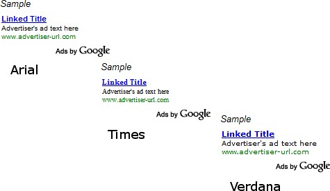
2. Font type
- apart from the graphics, the font type also says a lot in
the overall design of your website so you should choose
your font type carefully. In general, fonts used nowadays
are sans serif fonts which are easier on the eyes. Arial is
probably the most widely-used of these sans serif fonts.

3. Color
- once you’ve got the color scheme of your entire website
figured out, choosing the color of your font would be a
breeze. However, keep in mind that the color should
contrast well enough with the background so that it will be
easy to read.
Have you tried these things before? How did they work for you? Did they help your website or blog? We would like to know how they did for you? Leave your comments.
Dan and Deanna "Marketing Unscrambled"
6 comments:
Hi Dan and Deanna .. layout and presentation is so important .. keeping things balanced - so we don't put people off, keeping the impact obvious and not complicated, and generally providing a nice simple readable interesting website or post ..
Thanks - great ideas ..
Hilary Melton-Butcher
Positive Letters Inspirational Stories
Hi Dan & Deanna
My favorites Arial and I like just black. Thanks for sharing, sometime it is these simple thing that people over look.
Giovanna Garcia
Imperfect Action is better than No Action
Hi Dan & Deanna,
This was an informative post for someone to consider when starting or making changes to their website or blog.
Your points about the font and the size of the font are well taken. I examined a number of fonts prior to building my blog....I finally settled on arial but verdana also looks nice. Also, I use a larger font to make it more readable.
I do use color occasionally....normally to emphasize a point.
Pete Baca
The Car Enthusiast Online
Thank you Hilary,
Your points are right on. You spell it out nicely. Keep the good comments coming, it helps everyone to learn.
Dan and Deanna "Marketing Unscrambled"
Hello Giovanna,
Arial is very good it is one of the most used that there is. Most people choose black.
You are right to keep the simple things in mind as well. It is not good to overlook them. It could cost you sales if you overlook to many things.
Dan and Deanna "Marketing Unscrambled"
Hello Peter,
It always helps to have the larger font size for those of us that our eyes are not what they once were. The smaller fonts are harder to read for some of us.
You never know the people that are going to come to visit your website or blog. If it is too small for them to read they will not stay long.
Dan and Deanna "Marketing Unscrambled"
Post a Comment