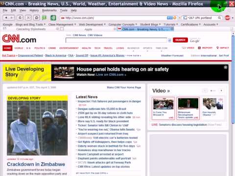
While rectangular shapes are better used on professional
websites, rounded boxes are more suited for websites that
aim to look playful, modern and experimental.
The boxes can be used in the design in a number of ways.
These include the header and the content. What’s great with
them is that they can divide the page into several parts
without actually using borders.
Here are some ways by which you can use rounded corners on
your website design:
1. Use images
- this is probably the easiest way of adding rounded boxes
on your web page. All you have to do is create a rounded
box using your favorite graphics editor, save it and use it
as a background image for the portion of the page of your
choice.
However, the images you use can add kilobytes to your page
which spells slower load times for users and higher
bandwidth usage on your part which is especially important
if you are paying hosting fees for your site.
(click to see video)

2. Use CSS
- Cascading Style Sheets is another way of creating rounded
boxes for your website. The great thing about this is that
since you’re only using a style sheet to create these
boxes, it eats up less bandwidth and the page loads faster.
This however, requires a reasonable amount of skill on
creating style sheets. There are a good number of websites
that deal with this which should be enough to help
beginners out.
Please leave your comments. We like to read them.
Dan and Deanna "Marketing Unscrambled"
4 comments:
Hi Dan and Deanna .. thanks for that .. a little beyond me at the moment .. too tired, but I'll get there in due time ..
So looked like a good video ..I just simply wasn't taking it in .. another day in the future ..
Thanks for the information though .. rounded takes up less space ..and is easier on our friendly eye ..
Thanks - Hilary Melton-Butcher
Positive Letters Inspirational Stories
Hi Dan & Deanna,
Good information on the video about HTML and building a website.
Thanks for the post!
Pete Baca
The Car Enthusiast Online
Hello Hilary,
Sometimes we get that way, to tired to take things in.
The rounded looks very nice. It is friendly on the eyes.
Thank you for your nice comments.
Dan and Deanna "Marketing Unscrambled"
Hello Peter,
You can learn a lot from videos.
Thank you for you nice comments.
Dan and Deanna "Marketing Unscrambled"
Post a Comment