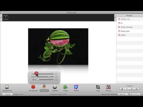
in Web 2.0 websites. This technique is often employed in
icons to create a 3D effect on the image.
The use of this design turns images that are otherwise
plain into visually-pleasing ones.
Want to make a 3D icon? Follow these steps:
1. Open your favorite graphics editing program.
2. Open or paste your image on the working area.
3. Create a copy of that image and place it directly where
you want to place the reflection. Remember that a
reflection is a mirror-image of the image. This is
important when making any reflections on your design.

4. Create a layer mask over a good portion of the
reflection.
5. Place a gradient effect on the remaining portion of the
reflection to create the illusion of a reflection.
6. Voila! You have now created a 3D icon.
Of course, there are several ways of creating this effect.
The one that we have shown you is only one of them. You can
find a lot more tutorials on the internet that will help
you achieve this effect. Choose one that you find most
effective.
However, keep in mind to use this effect sparingly. Just as
in any kind of visual effect, overdoing your reflections
can make your overall design look tacky and unprofessional.
You don’t want your design to look amateurish, right?
Subtlety is the key to creating great designs and you
should incorporate this in the designs that you make,
including creating reflections.
We love comments, please leave one.
( Hilary, we hope that this helped on this subject.)
Dan and Deanna "Marketing Unscrambled"
6 comments:
Hi Dan & Deanna
This is a great post. There are not a lot of information on this topic. Great job!
Thanks for sharing.
Giovanna Garcia
Imperfect Action is better than No Action
Hello Giovanna,
Thank you for your nice comments.
Dan and Deanna "Marketing Unscrambled"
Hi Dan and Deanna .. thanks for that .. is that the rounded boxes bit too ..
Thanks seeing Picturesque made sense .. interesting to see things work .. that was well explained on the video.
Thanks - helpful and explained! - for the personal note!!
All the best Hilary Melton-Butcher
Positive Letters Inspirational Stories
Hello Hilary,
Glad that you enjoyed that. See the corners of this page that is rounded boxes (the gray line inside the box that contains all the writing for this page.) That is graphics. Glad that the video helped. You are so welcome.
Dan and Deanna "Marketing Unscrambled"
Hi Dan & Deanna,
Depending on the website...3D images might be handy! I agree with you that they should be used sparingly.
Thanks for the information!
Pete Baca
The Car Enthusiast Online
You are so right Peter. Thank you for stopping by. Have a good day.
Dan and Deanna "Marketing Unscrambled"
Post a Comment